Metrohomes Design Build
A brand system is only worth what it carries. This one had to hold a website, the software a construction team runs on, a print pipeline and a campaign, and stay recognisable across all of them.
- Role
- Digital Lead
- Team
- Solo, reporting to the president
- Stack
- TypeScript, Next.js, React, Supabase
- Scope
- Brand, site, portal, print, campaigns
Overview
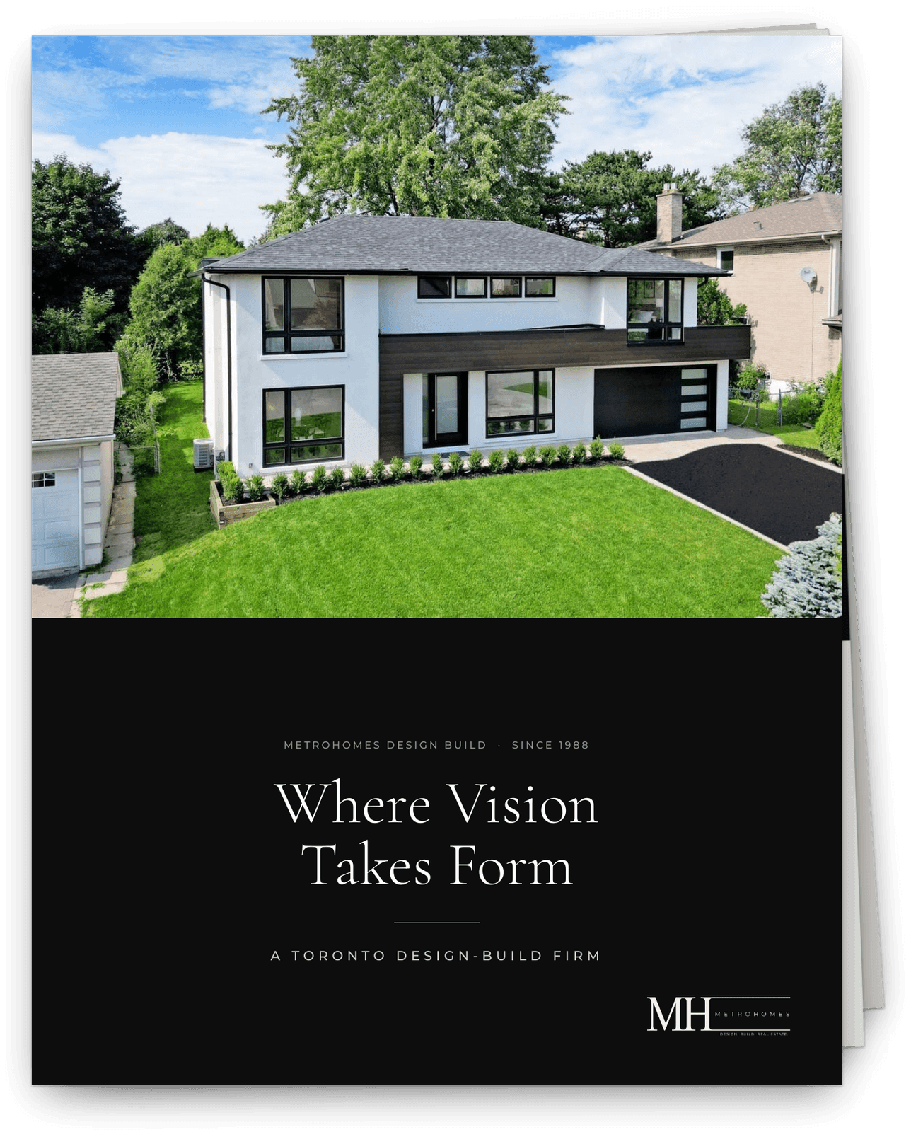
Metrohomes Design Build has been building in Toronto since 1988. I joined in January 2023 and took on the whole digital function: the brand system, the production site, the software the team runs projects on, the print collateral, and the campaigns that feed it.
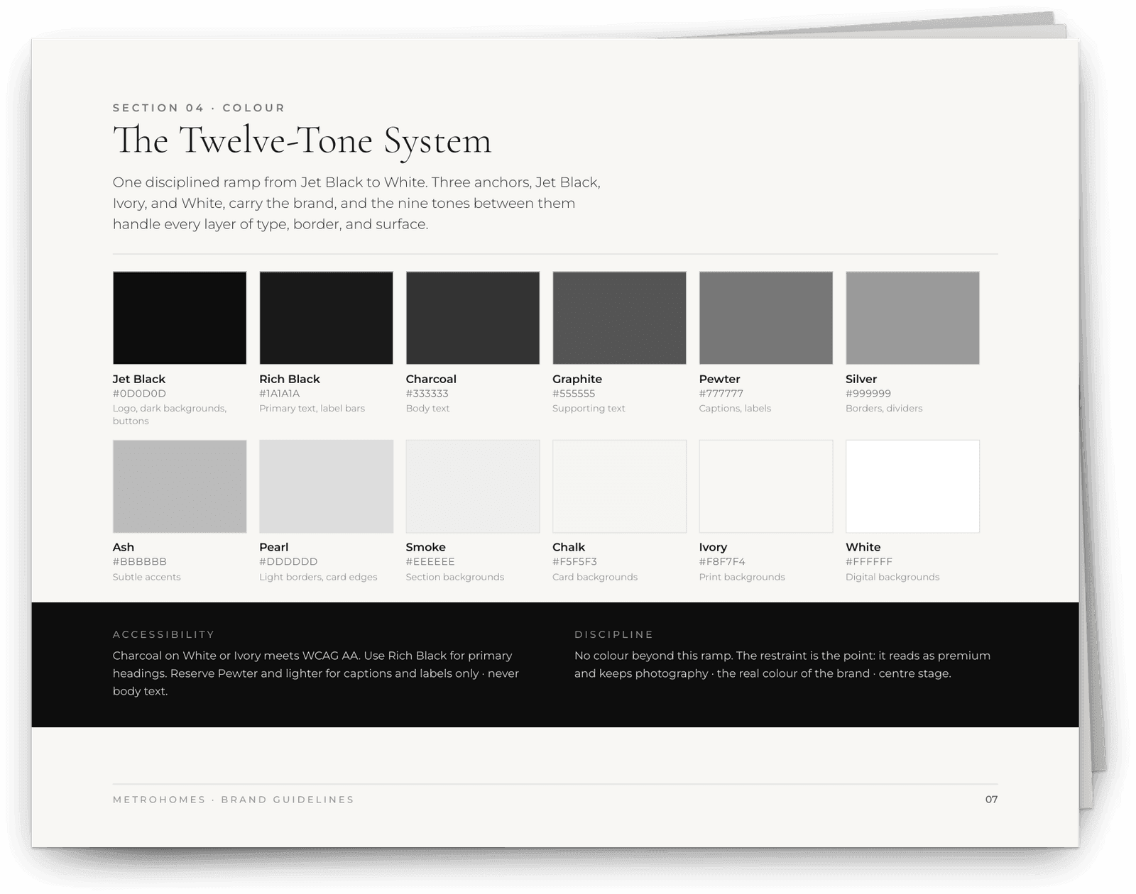
The through line is one set of tokens. Twelve named greys, three easing curves, one type pairing. A card on the website, a budget row in the portal and a page in the brand book are all built from the same values, so they agree with each other by default rather than by review.
A template with a ceiling
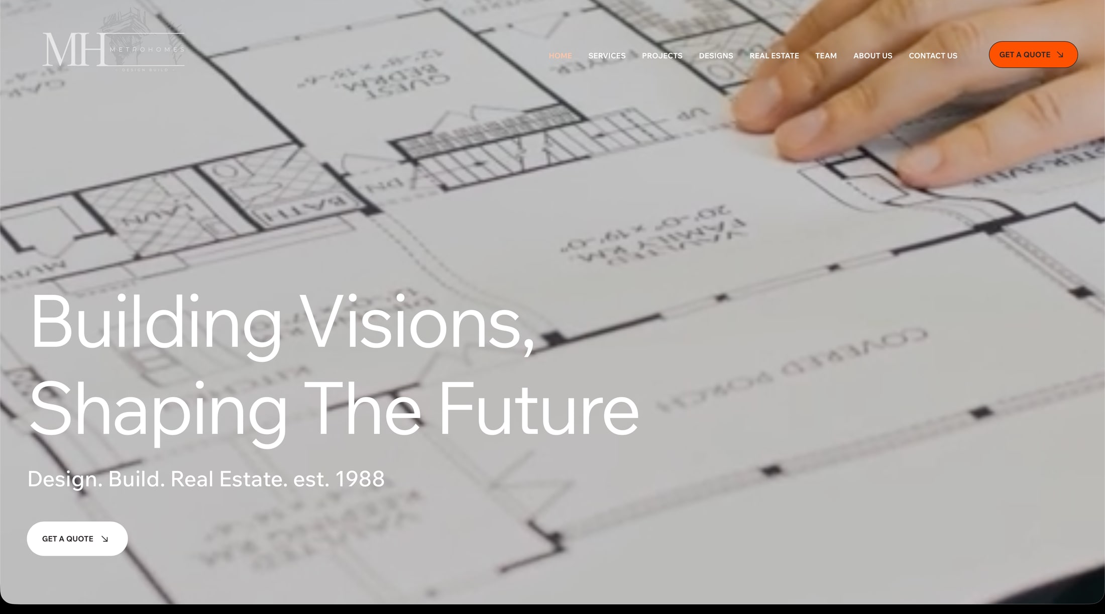
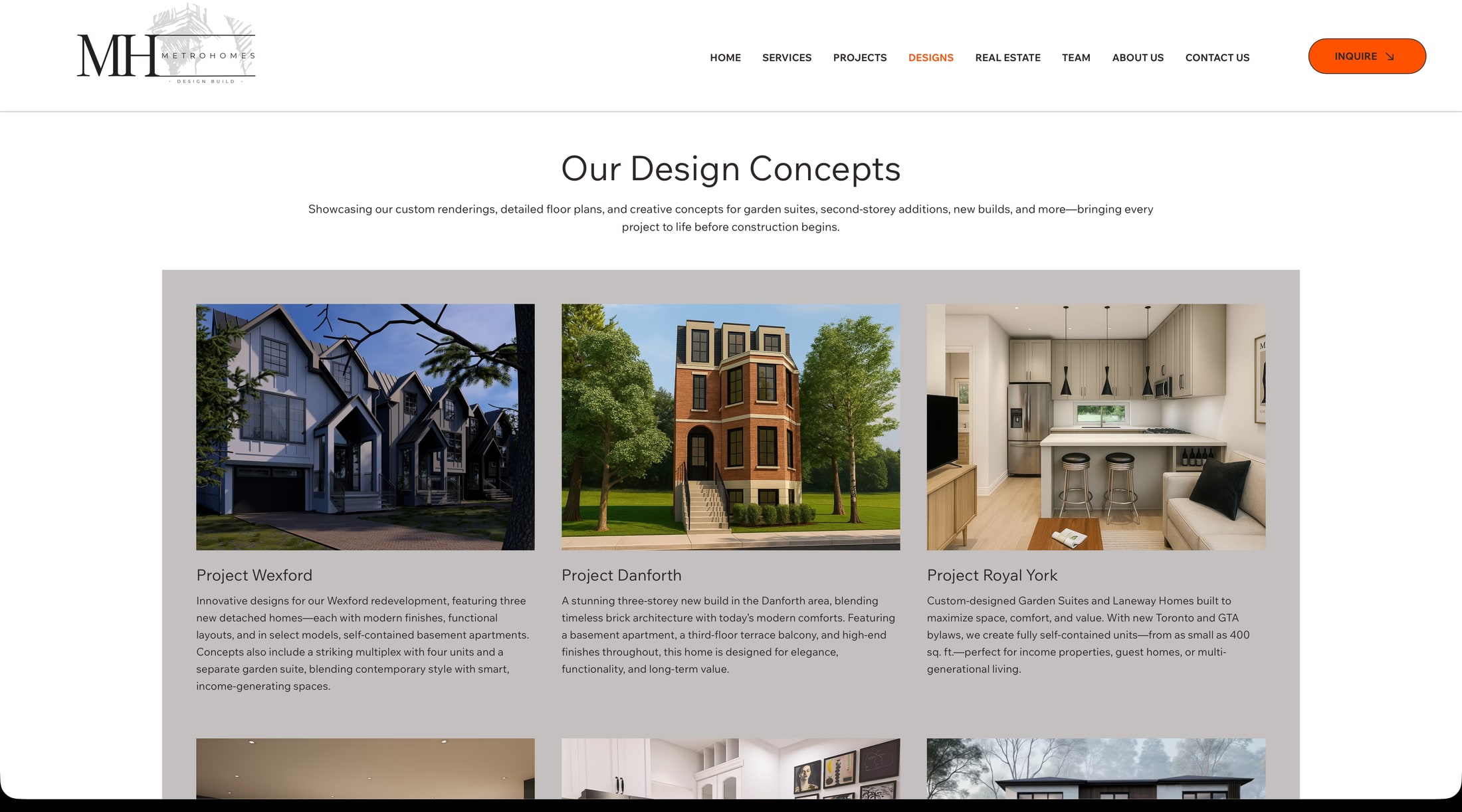
The company was running on a Wix template. The useful thing to say about it is that it did not look broken. It had a blueprint hero, a services menu, a stats bar and a grid of project cards, and it looked like every other design build company in Toronto.
That was the problem. It was not converting the traffic the ad spend was already buying, and it did not read as the work of a firm that had completed three hundred projects. Underneath both of those sat something worse: the platform capped what the business could become. Every new project meant bolting another card onto a page that could not hold them, and the idea the company most needed, a tool that tells a homeowner what their property can support, could not be built on a template at all.
So the site was not the deliverable. The deliverable was a system that generates leads, and the site was the first surface of it.
What I cut
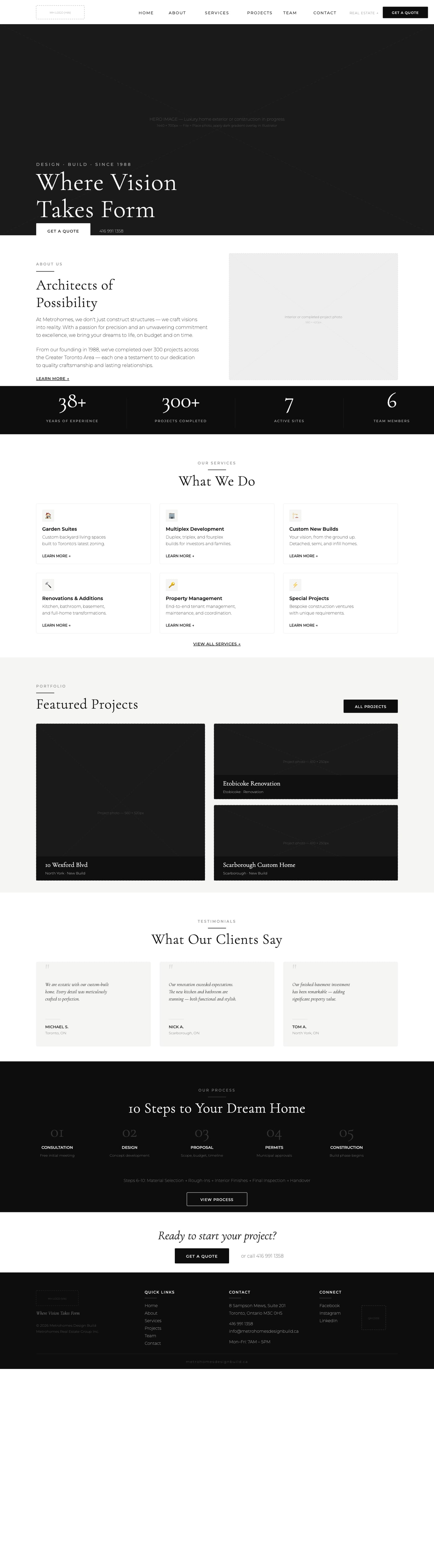
There was so much to change that I started by trying combinations. The first full mockup put everything on the homepage: a six card services grid, a ten step process section, testimonials, featured projects, a stats bar, and a closing call to action.
It was too busy, and the reason it was too busy is worth naming. I had just built the brand book, and the page was arranged to display it. Every section was another opportunity to show a type pairing or a card treatment. The homepage was working for the design system instead of for the person reading it.
The second pass moved depth off the front page. About became its own page. Services became its own page. Projects became cards that lead somewhere rather than paragraphs that sit there. The page did not get shorter, which I expected it to. It got longer and the site got much deeper, and it now runs to 297 routes. What changed was what the page is arranged around.
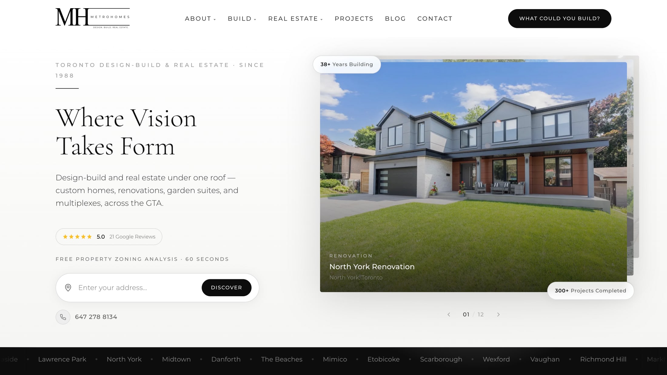
That was not the answer either. The version that shipped went further, and the clearest way to see the three passes is to follow one thing across them. The property assessment tool does not appear in the first mockup at all. In the second it exists, near the bottom, about four fifths of the way down the page. On the site as it shipped it is the hero: an address field, above the fold, before anything else is asked of you.
The thing the old platform made impossible ended up being the first thing the page lets you do. Everything else on the front page had to earn its place around it, which is how the Google reviews came to sit where a stranger decides whether to keep reading.


The system underneath
The tokens came first and everything else reads from them. Twelve greys, each named rather than numbered, running from jet black through pewter and ash to ivory. Three easing curves with their own names and their own jobs. One serif for display, one grotesque for text, a shadow pair, four breakpoints.
Naming a grey pewter is a small decision that pays for itself later. It means a conversation about a card border is a conversation about which token, not which hex, and the same answer holds when the card is a page in a brochure with bleed. The system spans screen and print, which is the part that was actually hard: an InDesign spread and a React component have to arrive at the same grey from different directions.
The portal
Before it existed, a project lived in emailed PDFs, a shared spreadsheet, photographs sent by text message, and pen and paper. None of it was in one place, and none of it agreed.
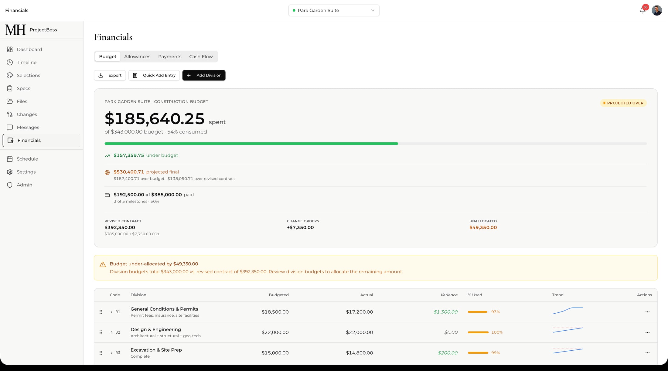
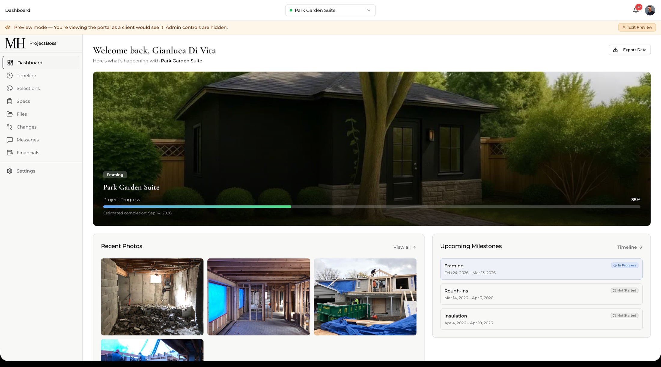
ProjectBoss holds a project as one dataset and shows two views of it. The team sees the construction budget by division, with what was budgeted against what has been spent, the variance on each line, and a projection of where it lands. The client sees the same project as progress: the phase it is in, the photographs from this week, the milestones ahead, and what they owe against what they have paid.
The interesting part is that this is one application with a role, rather than two products. An administrator can view the portal exactly as a client sees it, and the interface says so in a banner across the top. That constraint is what keeps the two views honest: there is no second dataset to drift.
What I would change
I built the brand from the ground up and got excited about design decisions that did not need making yet. The point of the site, the portal and the property tool was always lead generation, and for a stretch in the middle I was designing rather than building toward that.
Knowing twenty things are wrong does not mean fixing twenty things at once. Working through a project in stages and diagnosing what is actually needed at each one would have got the same place faster.
Want to talk about building something like this?